Carnegie Mellon University

Human-Computer Interaction Institute
I have included two projects from my Masters degree classes below.
MOBILE APP DESIGN
Band Together
This project was completed as an Interaction Design Fundamentals project on mobile information systems. My team was given a prompt to design a mobile app for EMS personnel and ambulance attendants based on two personas that we were given. As one of the Project Managers of the team, I led work sessions, collected and organized feedback, distributed responsibilities according to team strengths and learning preferences, and documented the design process for our final deliverables. Individually, I developed the chosen app concept, scenarios, and initial wireframes for the design. I also worked with my team to develop the rest of the user experience and visual design of the app.
Project Details
Role: Project Manager and UX Designer
Project Type: Class Project for Interaction Design Fundamentals
Team: Matthew Bolaños, Jim Martin, Ryan Brill, Mu-Hwa Kuo
Platforms: Mobile
Tools: Illustrator
Timeline: 1 month
Mission
“[The patient] went absolutely nuts – violent, kicking, swinging, punching, all over us…”
This is a real quote from an EMT responding to what appeared to be an innocuous call. Paramedics have an injury rate at three times the national average for all occupations. In fact, patients accounted for 37 percent of reported injuries to EMTs in the US between 2003 and 2007. We wanted to reduce these figures and help those who have made it their job to help us despite the risk. We created Band Together, a silent alarm app to obtain direct help for EMS workers from their teammates and the police in potentially dangerous situations.
Process
-
Literature Review
First, we performed a brief literature review focusing on the requirements for the profession, related physical and mental constraints, major pain points, and gaps in current EMS/ambulance solutions.
-
Ideation
Next, we brainstormed potential app ideas and classified them according to feasibility and usefulness. We narrowed down our ideas until we reached the Band Together concept.
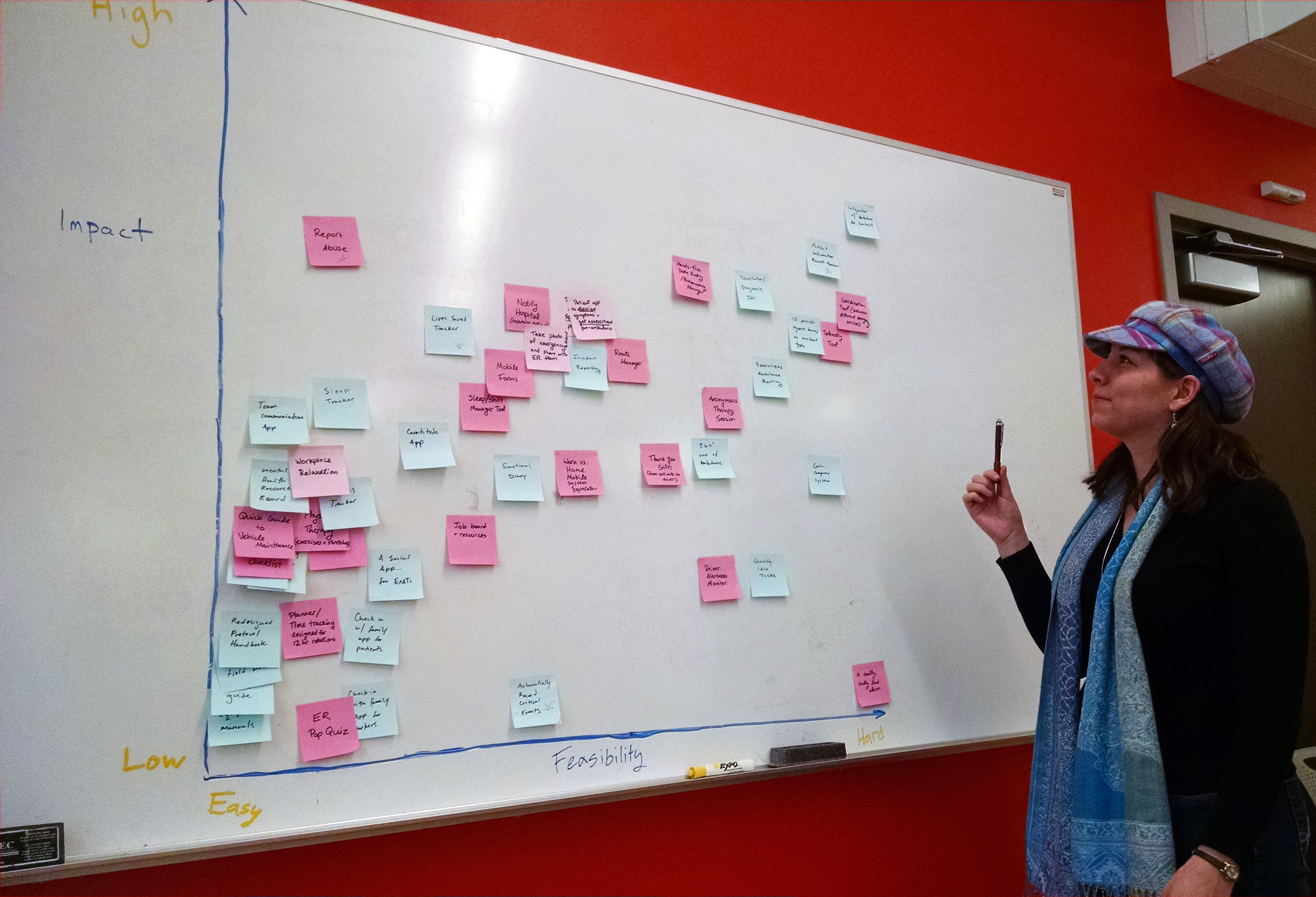
Ideas organized by impact and feasibility
-
Design
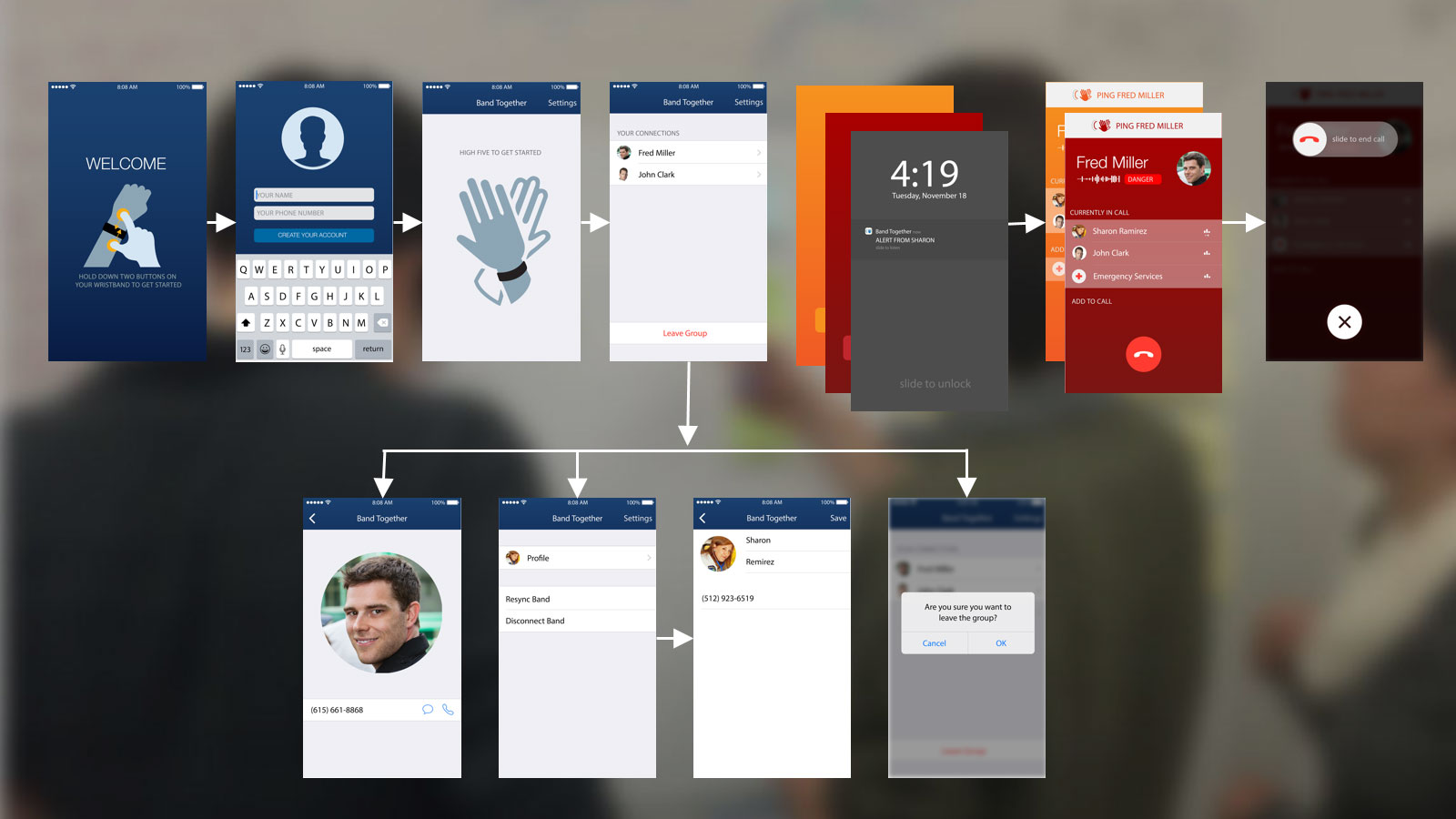
After honing the idea further, we focused on the UX and visual design of the app. In-class critiques spurred the iterative design process of the app from the screens flow to wireframes to the final visual design. Other final deliverables for this project included a narrative for each persona and a design specification document for the app.

Design of application flow
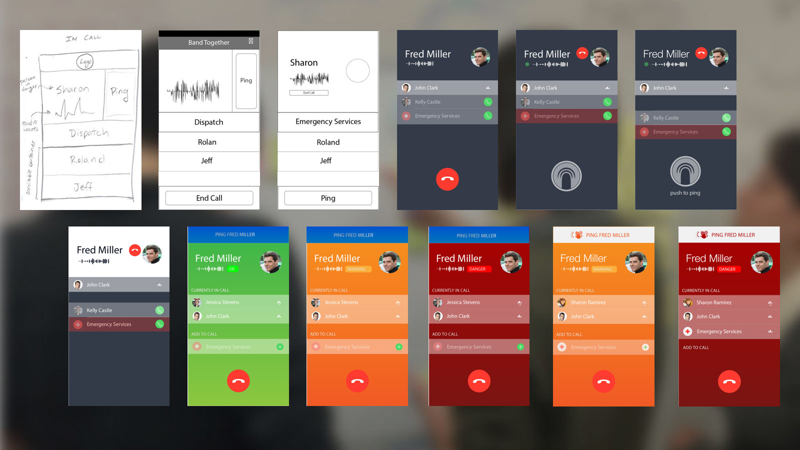
Iterations of the design
Final application design
REDESIGN & CODED PROTOTYPE
Karaoke UI
The prompt for this assignment was to redesign the user interface of a digital product that we thought is often poorly designed. For my project, I chose a karaoke console since the interfaces of karaoke consoles are often cluttered and difficult to just walk up and use. In this assignment, the focus was on prototyping with different levels of fidelity and usability testing. I created a low fidelity prototype using paper and pencil, two medium fidelity prototypes using Balsamiq, and two high fidelity coded prototypes using ActionScript 3. For each iteration I tested the prototype with two to three users, created heuristic evaluation reports, and made changes accordingly.
Project Details
Role: UX Designer, Usability Tester, Programmer
Project Type: Class Project for Programming Usable Interfaces
Team: Individual Project
Platforms: Web
Tools: Balsamiq, ActionScript 3
Timeline: 1 month
Mission
I love box style karaoke venues for singing. In karaoke box venues, you can rent out a small or medium sized room with a karaoke setup for just you and your friends. Each room has its own console or remote that serves as the interface between the users and the song database. However, this interface is often in another language, overly complicated, and stuffed with extra features. This can make interpreting the interface elements very difficult when you really just want to complete the simple task of selecting and playing a song. In this project, I redesigned the song selection interface for a box karaoke touchscreen console while focusing on simplicity, usability, and user convenience.
Process
Over the course of the design process, I created one paper prototype, two Balsamiq prototypes, and three higher fidelity prototypes coded in ActionScript 3. For each iteration I tested the prototype with two to three users in Think Aloud studies, created usability aspect reports, and made changes accordingly.
-
Paper Prototype
I began the prototyping process by creating cheap, simple sketches using paper and pencil. The interface had three basic functions: a sortable list of songs in the database, a search function for the database, and the song lyrics screen. To test the prototype, I asked users to complete a series of tasks related to normal karaoke interaction goals and the features present in the prototype. Two main findings from these tests were that the users did not find the more complicated keyboard functions like Caps Lock necessary in this medium and that they would like to be able to browse in reverse alphabetical order as well since I already allowed A to Z sorting.
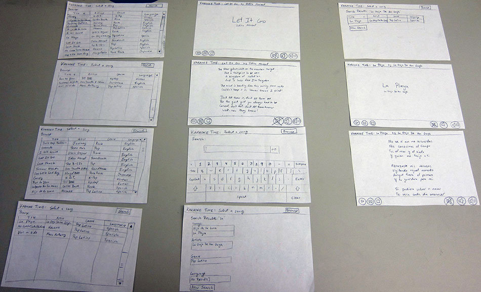
Overview of paper prototype screens
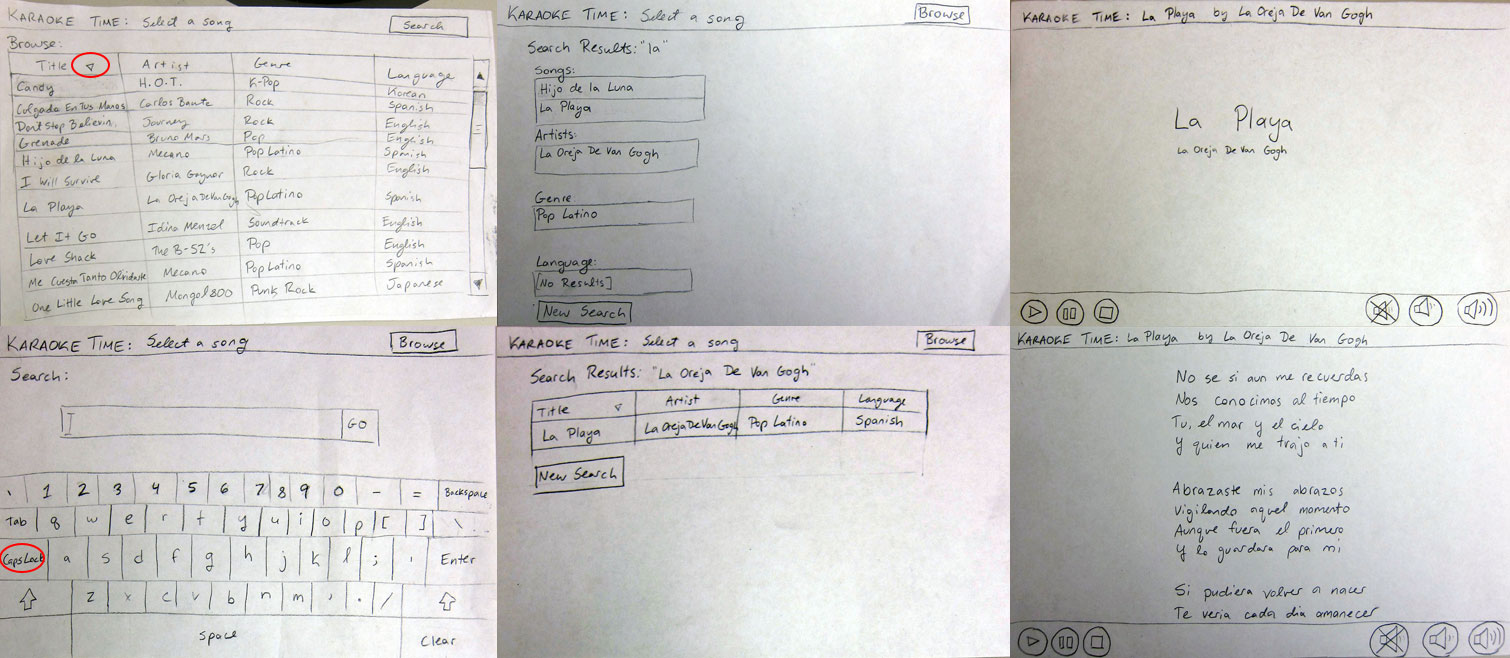
Paper prototype testing results
-
Balsamiq Prototypes
Next, I moved to Balsamiq prototypes to provide a more polished, but still changeable feel. The users could interact with the prototype by clicking through planned paths to navigate the interface.
To begin with, I focused on the song sort, add, and reordering functions of the interface. In the first prototype tests, users enjoyed the flexible sorting on all categories in the song database, but really wanted a faster way to add multiple songs at once and reorder songs. More specifically, many users attempted to drag and drop the songs to change their order in the playlist, following current industry standards in playlist design.

First Balsamiq prototype close-ups and testing results
For the second prototype, I added in the search screens that I had originally tested in my paper prototype and created a way to quickly add songs from the main song list. Although Balsamiq did not have a good way to provide or indicate drag and drop functionality, I added a note next to the playlist to explain the new interaction. Users responded favorably to the new add song button and feedback as well as the drag-and-drop change. However, users did not understand how to start a search or why the search results are originally categorized into different sections (Songs, Artist, Genre, and Language).
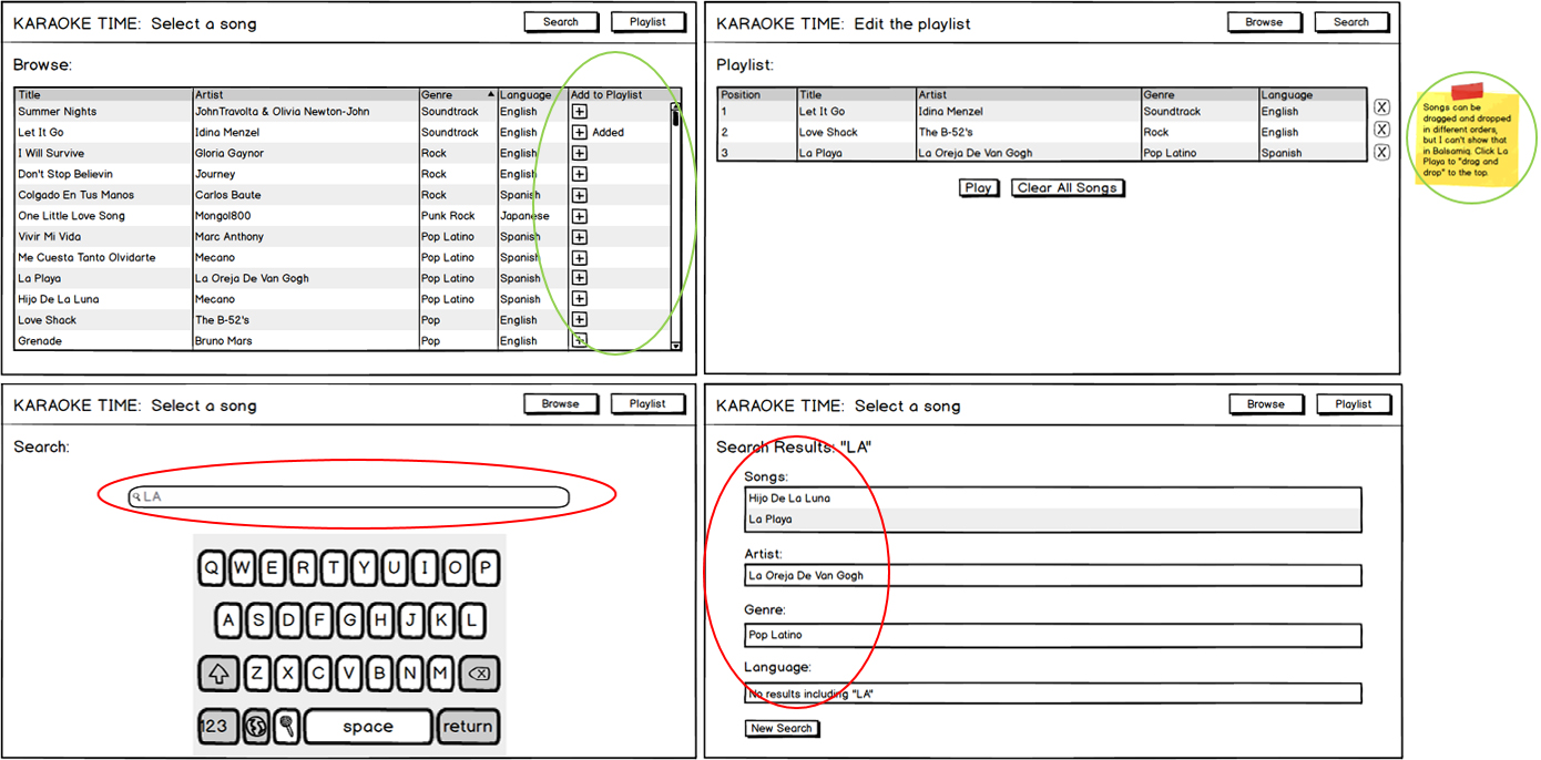
Second Balsamiq prototype close-ups and results
-
ActionScript 3 Prototypes
Moving on to higher fidelity prototypes, I coded up the whole design and made changes to address the issues highlighted in the previous usability tests. I added a distinct search button at the end of the search bar and combined all of the search results into one sortable database view. I received good feedback for both of these changes. The results of the tests of the first coded prototype highlighted some bugs in the code, no clear affordance for drag and drop in the playlist, inconsistent button layouts, and a desire for a way to quickly remove songs from the playlist on the main song list screen and the playlist screen.

First coded prototype close-ups and testing results
Online Version of First Coded Prototype
All of the changes that I made to the second coded prototype in response to the previous test results, worked well and were remarked on positively.
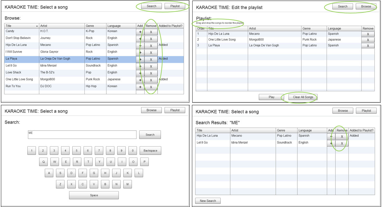
Second coded prototype close-ups and testing results
Online Version of Second Coded Prototype
Samples of Usability Aspect Reports
For the final prototype, I wanted to tighten up some of the design elements. Although the buttons were more consistent now, I wanted to improve cognitive orientation and muscle memory by keeping all three buttons in the same order and in the same locations on every page. To create clear signals about which functions were available at which times, I created a disabled state for the inactive buttons on each screen. In addition, I re-added the dash (-) key to the keyboard since the symbol was present in one of the song entries, made the Add and Remove columns unsortable since that was creating arbitrary sort patterns, and added a Clear button next to the Search button in the search bar row.
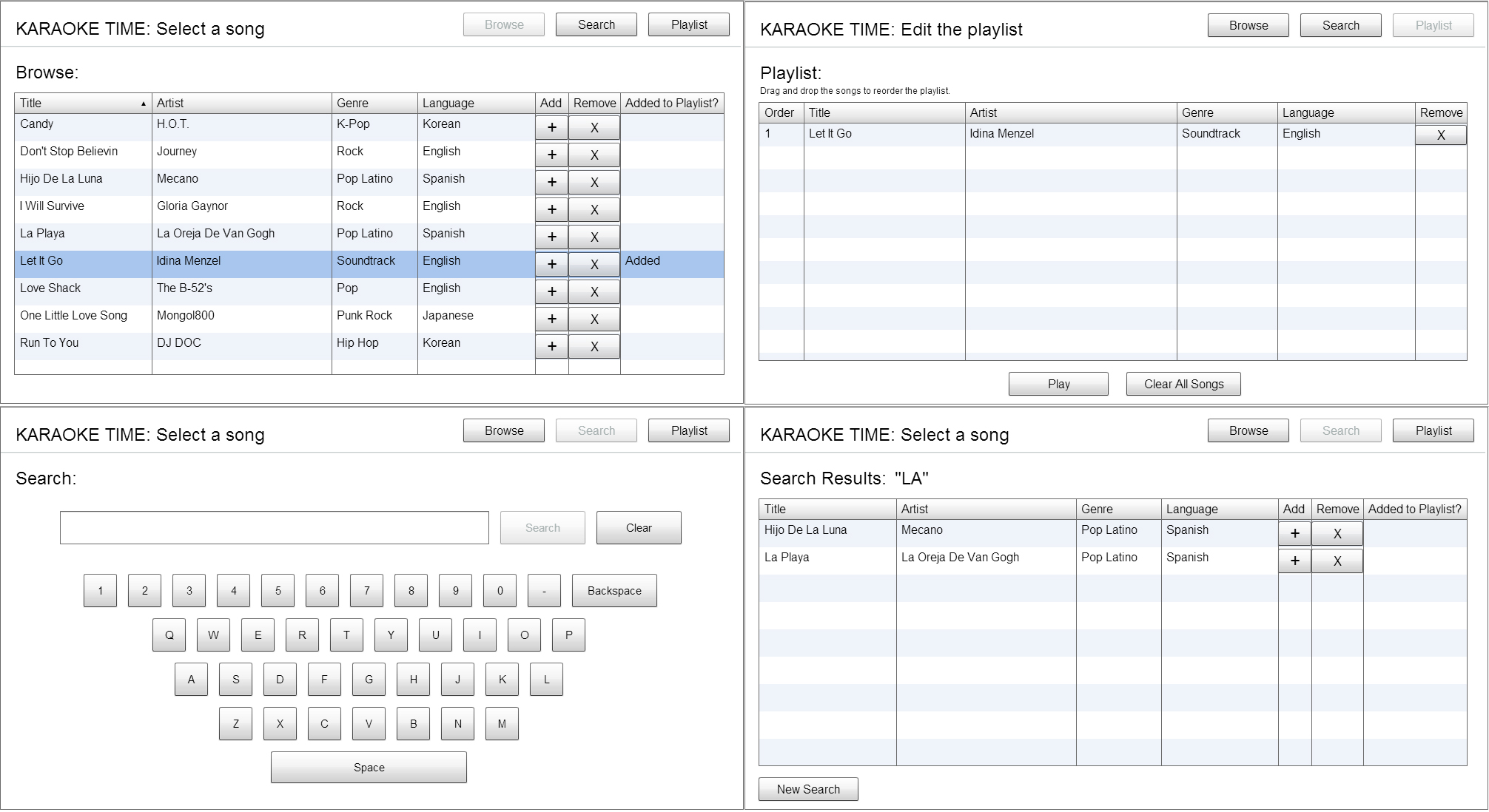
Screenshots of the final prototype
Online Version of Final Coded Prototype